Brand guidelines
Brand.
Quiet. Warm. Private. KidTag's brand is built around trust between neighbors, not attention from strangers. Everything here serves that.
Color.
The palette is grounded in warm neutrals with two accents. Paper is the canvas. Ink is the voice. Clay carries warmth and emphasis. Sage carries confirmation and trust.
Paper
#F4EEE3
Paper 2
#EADFCB
Cream
#FBF7EE
Ink
#141B2D
Ink Soft
#4A4F58
Muted
#5A5346
Rule
#D8CFBE
Clay
#B85C3C
Sage
#7A9065
Typography.
Three families, each with one job. All three are open-source and licensed under the SIL Open Font License.
Fraunces is shipped in the regular (upright) style only. font-synthesis: none is set on body so the browser never fake-italicizes Fraunces. Italics fall through to Instrument Serif italic on purpose.
The em accent.
Every italicized phrase on the site is set in Instrument Serif italic, clay. The contrast against upright Fraunces is the typographic gesture that makes copy feel KidTag.
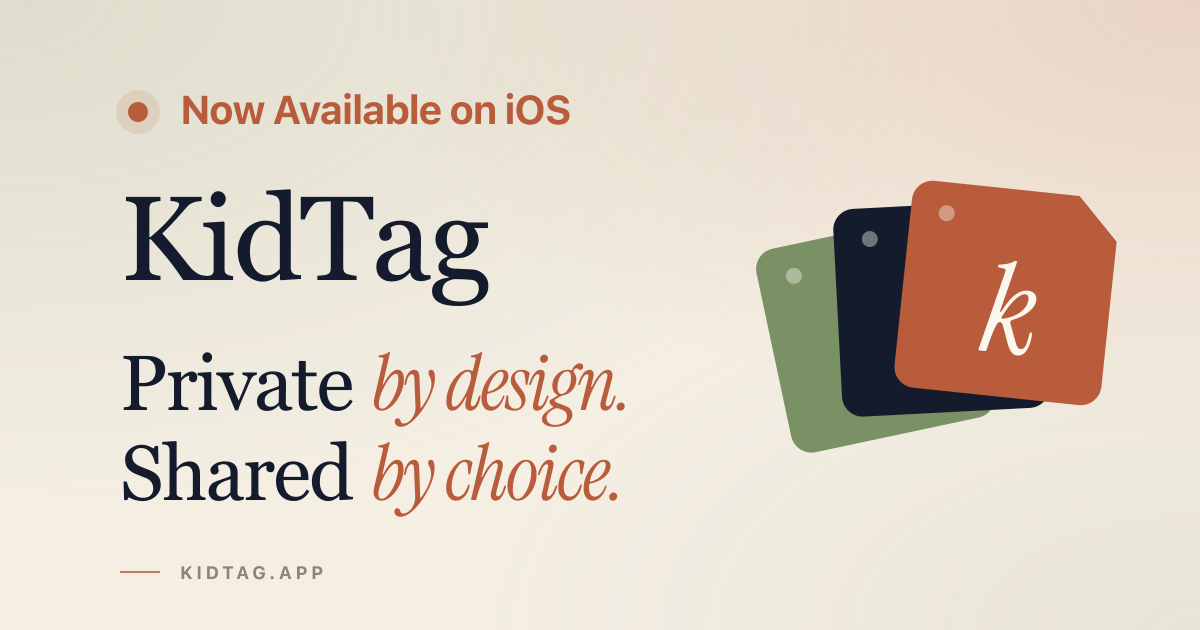
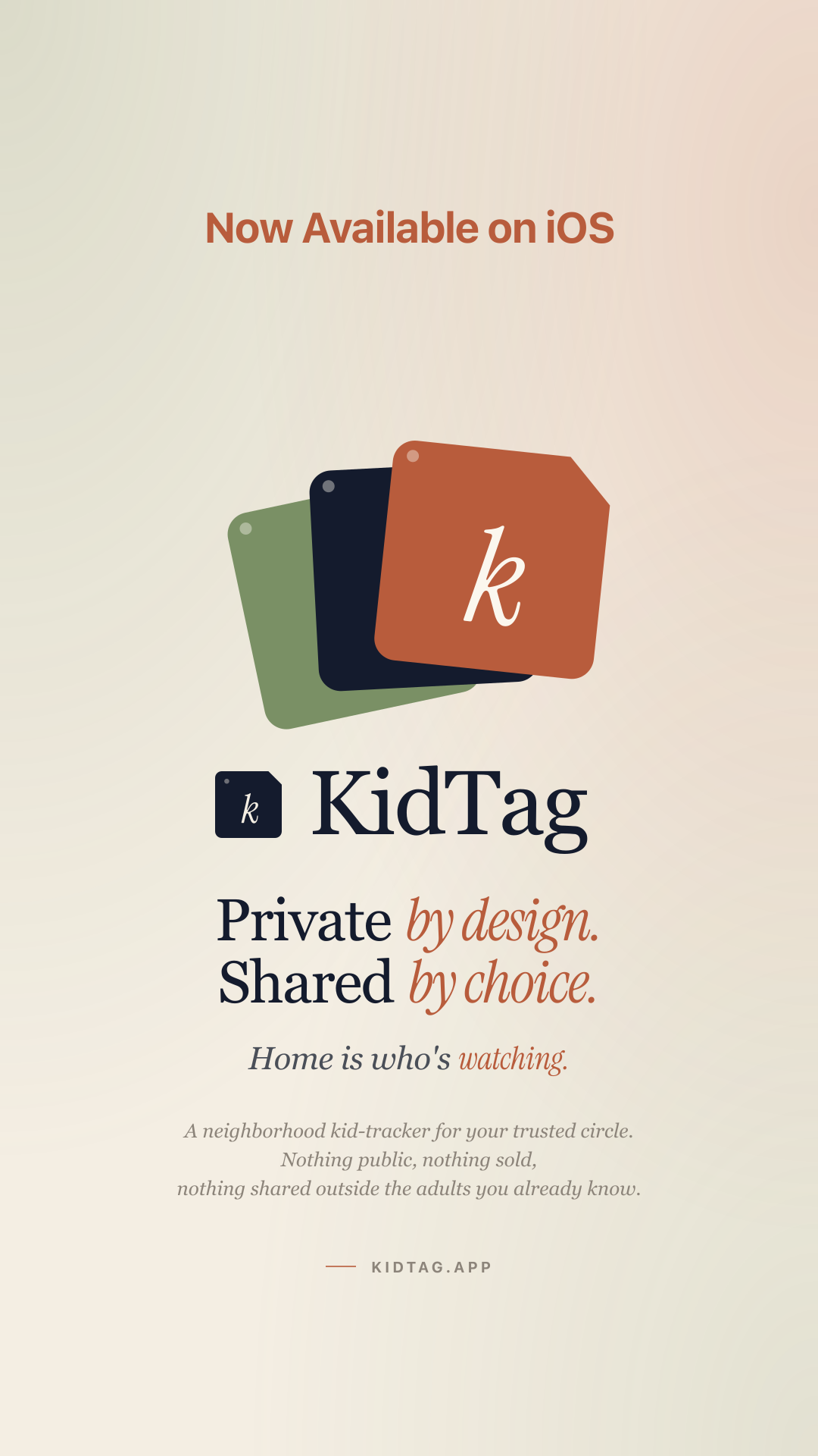
Private by design. Shared by choice.
Home is who's watching.
Three steps. Nothing clever.
A tracker that quietly refuses to be a surveillance tool.
Mark and lockup.
The mark is a rounded name-tag with a notch and an italic Instrument Serif "k" inside. Default fill is ink. The inner letterform is always cream/paper for contrast.
The lockup places the mark to the left of "KidTag," cap-aligned.
Voice.
Quiet. First-person plural when we have to. Lower-case for incidental UI text, sentence-case for sentences. We italicize the small turn at the end of a phrase; that emphasis carries the warmth.
We say
- Trusted circle
- Neighborhood
- Household
- Quiet
- Tag in, tag out
We avoid
- Users, customers
- Monetize
- Engagement
- Viral
- Check in, check out
We don't sell. We don't track. We don't broadcast.
Canonical lines.
These are the strings to use verbatim in press and promo. Don't paraphrase.
Hero
Private by design. Shared by choice.
Home is who's watching.
One-line description
KidTag is a quiet, private kid-tracker for parents in a small trusted circle of neighborhood households. Tag the kid in when they arrive at a friend's house, tag them out when they leave. Visible only to the households you've invited. Now on iOS.
Taglines
- Three steps. Nothing clever.
- Tap the kid in.
- Parents see it, quietly.
- A day's worth of quiet.
- Quiet software for the people you trust.
Downloads.
Assets for press, editorial, and partners. Right-click to save, or open the SVG link directly.



Questions about usage? [email protected].